About
This worksheet was adapted from the fourth lecture in DSCI 100, an introductory data science course for undergraduate students offered at The University of British Columbia.
Learning Objectives
The goal of this worksheet is to expand your data visualization knowledge and tool set. We will learn effective ways to visualize data, as well as some general rules of thumb to follow when creating visualizations. All visualization tasks in this tutorial will be applied to two datasets of widespread interest.
After completing this worksheet you will be able to:
- Describe when to use the following kinds of visualizations to answer specific questions using a dataset:
- scatter plots
- line plots
- bar plots
- histograms
- Given a dataset and a question, select from the above plot types and use
Rto create a visualization that best answers the question - Given a visualization and a question, evaluate the effectiveness of the visualization and suggest improvements to better answer the question
- Interpret the visualization in the context of the research question
- Referring to the visualization, communicate the conclusions in nontechnical terms
- Use the
ggplot2library inRto create and refine the above visualizations
Prerequisite Knowledge
This worksheet accompanies the material in Chapter 4 of Introduction to Data Science, an online textbook which covers introductory data science topics. You should read that chapter (as well as the preceding ones) before attempting the worksheet, or at least check that you know the material in Chapters 1 through 4.
Specifically, you should be familiar with the dplyr package in R and, particularly, with the following topics covered in Chapter 3 of Introduction to Data Science:
- The pipe
%>% - The functions
mutate,filter,group_by,summarise,top_n, andarrange - How to use different
_joinfunctions
You should also have some knowledge of the ggplot2 package. Specifically:
- What aesthetics, geometries, and scales are in
ggplot2 - How to add new layers to a ggplot object
Finally, you should also have a working knowledge of the plots listed in the first learning objective and to what data type they can be applied. (E.g. you should know what a scatter plot is and also that two quantitative variables are required to produce one.)
1. World Vaccination Trends
Data scientists find work in all sectors of the economy and all types of organizations. Some work in collaboration with public sector organizations to solve problems that affect society, both at local and global scales. Today we will be looking at a global problem with annual data from 1980 to 2017 from the World Health Organization (WHO). According to WHO, polio is a disease that affects mostly children younger than 5 years old, and to date there is no cure. However, when given a vaccine, children can develop sufficient antibodies in their system to be immune to the disease. Another disease, Hepatitis B, is also known to affect infants but in a chronic manner. There is also a vaccine for Hepatitis B available.
The columns in the dataset we are going to be working with are:
who_region- The WHO region of the worldyear- The yearpct_vaccinated- Estimated percentage of people currently in the region who had received a vaccination in that year or earlier (either a polio or Hepatitis B vaccine or both)vaccine- Whether it’s thepolioor thehepatitis_bvaccine
We want to know three things. First, has there been a change in polio or Hepatitis B vaccination patterns throughout the years? And if so, what is that pattern? Second, have the vaccination patterns for one of these diseases changed more than the other? Third, has there been any difference in polio or Hepatitis B vaccination patterns across different world regions? The goal for today is to answer these questions by determining, creating, and studying appropriate data visualization displays. To do this, you will follow the steps outlined below.
The original datasets are available here:
- Polio: http://apps.who.int/gho/data/view.main.81605?lang=en
- Hepatitis B: http://apps.who.int/gho/data/view.main.81300?lang=en
These datasets were reshaped and merged into a single dataset, with which we will be working today. It has already been stored in the world_vaccination object in R.
Now we can start our analysis. Before starting to create plots, however, we should think about what type of display would be useful in this situation. People sometimes find it difficult to find an adequate plot. It can be hard to do so, but it is important!
Recall that we are interested in studying polio and Hepatitis B vaccination trends throughout time and across world regions. Consider the following two displays:
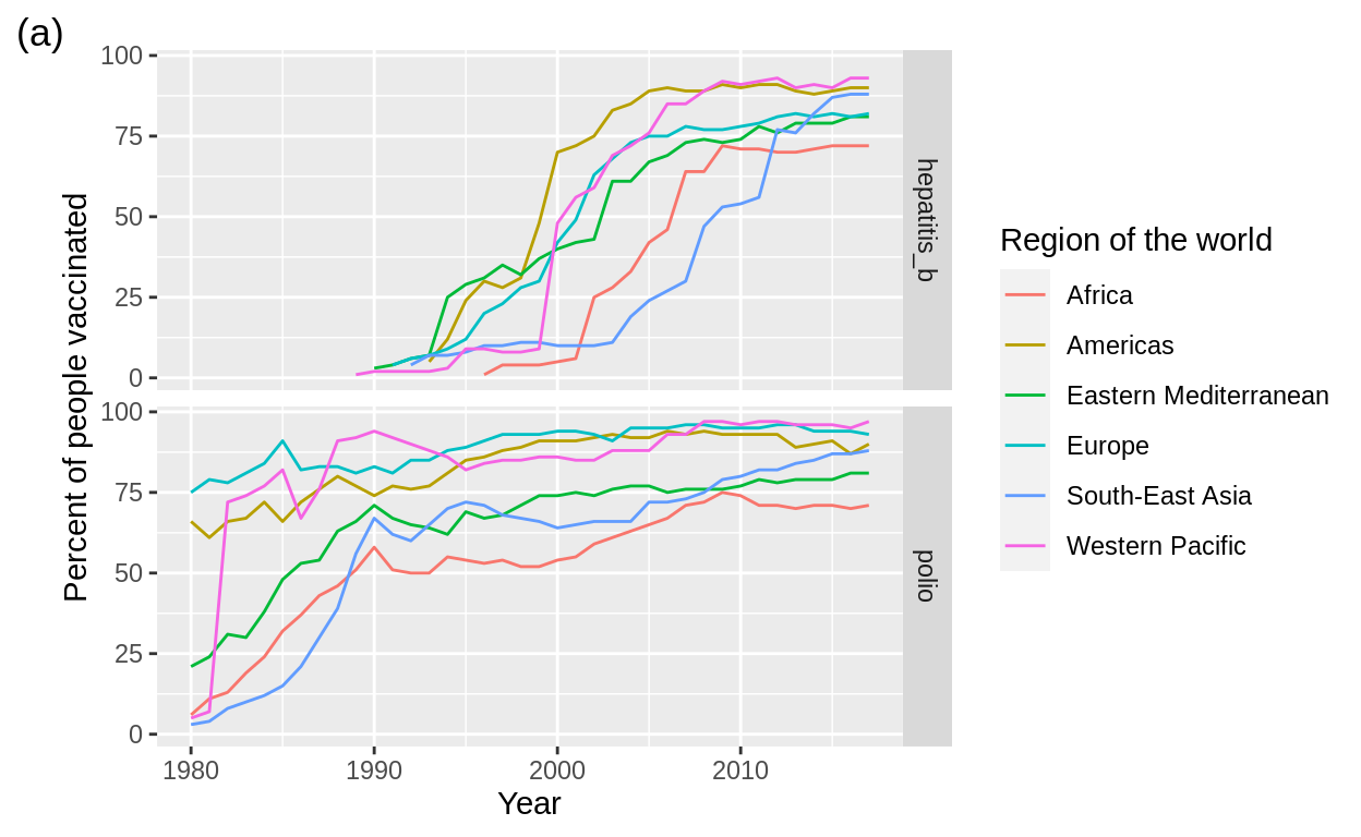
In order to answer today’s questions, we will produce a plot of the estimated percentage of people vaccinated per year and world region. We will start with a simple plot and build on it to produce a plot similar to plot (a) above.
Question 1.1
Before starting creating plots, we have to reshape the data by removing rows that have NA’s or values that we are not interested in. When you want to filter for rows that aren’t equal to something, you can use the != operator in R. For example, to remove all the cars with 6 cylinders from the mtcars built-in R dataset we would do the following:
head(mtcars)filter(mtcars, cyl != 6) %>%
head()Filter the world_vaccination dataset so that we don’t have any NA’s in the pct_vaccinated column. This can be achieved using the is.na function in R, which detects which rows are NA. We also want to filter out the (WHO) Global region as it is just the average of the other regions. Fill in the ... in the code below. Assign your filtered data to the same object called world_vaccination.
world_vaccination <- world_vaccination %>%
filter(!is.na(...), ... != "(WHO) Global")
head(world_vaccination)Question 1.2
Create a scatter plot of the percentage of people vaccinated (y-axis) against year (x-axis) for all the regions in world_vaccination. Make sure to label your axes with human readable labels. Ignore all other variables.
Assign your plot to an object called world_vacc_plot and print it afterwards
world_vacc_plot <- world_vaccination %>%
  ggplot(...) +
  geom_...() +
  labs(... = ...,
       ... = ...)
world_vacc_plot
Question 1.3
Now that we see how the percentage of people vaccinated varies over time, we should start to look for any differences between the percentage vaccinated for polio and the percentage vaccinated for Hepatitis B.
Using different colours to differentiate between groups is a good option. However, when there aren’t many groups between which we want to differentiate, different shapes combined with different colours are also useful. This is also relevant to account for people who are colour blind, or when your work will be printed in grayscale.
ggplot2 also has alternative colour palettes for colourblindness, such as the viridis palette. We will not learn how to use them in this activity, but if you are interested be sure to check it out!
Question 1.4
Now that we know how we will separate the data for our visualization, let’s do it. Start by copying your code from question 1.2. Next, add an aes function inside of the geom_point function to map vaccine to colour and shape. Your geom_point function and layer should look something like this:
geom_point(aes(colour = ..., shape = ...)) +Finally, make sure you change all the axes and legends so that they have nicely formatted, human-readable labels. To do this, we will remove the xlab and ylab label functions and just use the more general labs function, specifying all the aesthetics we want to label:
labs(x = "...", y = "...", colour = "...", shape = "...")Fill in the ... in the cell below.
Assign your answer to an object called compare_vacc_plot.
compare_vacc_plot <- ... %>%
  ggplot(aes(...)) +
  geom_point(aes(colour = ..., shape = ...)) +
  labs(x = ...,
       y = ...,
       colour = ...,
       shape = ...)
compare_vacc_plot
We can see that in some segments of the data, polio vaccinations were fairly common in 1980—although we can’t see it in this plot, we can infer that this is because in some regions of the world polio vaccinations were already well underway in 1980, while in other regions they were not. In contrast, vaccinations against Hepatitis B didn’t start until around 1990. We see that, for some segments of the polio data, the rate of increase in percentage vaccinated appears to be similar to the rate for Hepatitis B vaccinations. Currently, the percentage vaccinated for polio is about the same as the percentage vaccinated for Hepatitis B, just occurring 10 years earlier. However, there is some other variation in the data. Perhaps that could be attributed to region? Let’s create some more visualizations to see if that is indeed the case.
To get started, let’s focus on the polio vaccine data and, after that, we’ll look at both vaccines together.
Question 1.5
Create a data frame object named polio that contains only the rows where the vaccine is "polio":
polio <- ---

head(polio)
Question 1.6
Now create a scatter plot using the polio data where percentage vaccinated is on the y-axis, year is on the x-axis, and each group has a different coloured point and a different shape. Name it polio_regions.
Fill in the ... in the cell below.
polio_regions <- polio %>%
  ggplot(aes(x = ..., y = ...)) +
  geom_point(aes(colour = ..., shape = ...)) +
  labs(x = "...",
       y = "...")
polio_regions
Question 1.7.1
When we have multiple groups it’s easier for us to see the differences when we change point colour and shape. However, at some point there are too many groups to keep things straight. We are approaching that on the plot above, and so we need to do something different. One thing we could try is to change the point to a line to reduce the noise/chaos of the plot above. We would also not have a shape. Do that in the cell below and name the plot object polio_regions_line.
polio_regions_lineQuestion 1.7.2
One thing that is still not ideal in the visualization above is the legend title “who_region” – it is not very readable. Let’s add another layer to polio_regions_line to change that. To do this we use the labs function and choose the aesthetic mapping (here colour) that we want to apply the legend title to. Also, given that we created an object from our previous plot, we do not need to retype all our code, but instead can just say:
[your plot object] <- [your plot object] +
                        [new layer code]
Fill in the ... in the cell below.
polio_regions_line <- polio_regions_line +
    labs(... = "Region of the world")
polio_regions_line
Question 1.8
In this case we would like two side-by-side or two vertically arranged plots. If that data are in the same data frame (as ours were in the world_vaccination data frame) then we can use a technique called facetting to do this.
There are two facetting functions in R, but the one we will see here is facet_grid. The basic syntax for this ggplot layer is the following:
# creates side by side plots for each member of the category in COLUMN_X
facet_grid(. ~ COLUMN_X)
or
# creates vertically arranged plots for each member of the category in COLUMN_X
facet_grid(COLUMN_X ~ .)
Create a plot like the one named polio_regions_line but instead of using the polio data frame, use the world_vaccination data frame, and facet on the column vaccine so that the two plots are side-by-side. Name this plot object side_by_side_world.
Fill in the ... in the cell below.
side_by_side_world <- ... %>%
    ggplot(...) +
    geom_...(...) +
    labs(...) +
    xlab(...) +
    ylab(...) +
    facet_grid(...)
side_by_side_world
Question 1.9.1
Now use facet_grid to arrange the same two plots vertically. Name this plot vertical_world.
vertical_worldWhich arrangement is better? Depends on what you are asking! If you are interested in comparing the rate at which things changed over time, then the vertical arrangement is more effective. However, if you are interested in comparing the exact percentage values between the lines at certain points then the side-by-side arrangement is more effective.
Question 1.9.2
2. Fast Food Chains in the USA
With their cheap meals and convenient drive-thrus, fast food restaurants are a growing demand in many countries. Despite their questionable ingredients and nutritional value, most Americans count on fast food in their daily lives (they are often delicious and so hard to resist…).

Source: https://media.giphy.com/media/NS6SKs3Lt8cPHhe0es/giphy.gif
According to Wikipedia,
Fast food was originally created as a commercial strategy to accommodate the larger numbers of busy commuters, travelers and wage workers who often didn’t have the time to sit down at a public house or diner and wait the normal way for their food to be cooked. By making speed of service the priority, this ensured that customers with strictly limited time (a commuter stopping to procure dinner to bring home to their family, for example, or an hourly laborer on a short lunch break) were not inconvenienced by waiting for their food to be cooked on-the-spot (as is expected from a traditional “sit down” restaurant). For those with no time to spare, fast food became a multi-billion dollar industry.
Currently, fast food is very popular and lots of businesses are investing in advertisement as well as new ideas to make their chain stand out in the sea of restaurants. In fact, a business wishing to buy a franchise location in an existing chain is hiring you as a consultant. They want to know the current market situation to set up a franchise in a state on the west coast of the United States (California, Oregon, or Washington) with few fast food restaurants. Particularly, they would like to set up a franchise that is consistently popular on the west coast, but in a state which has few fast food restaurants.
In this assignment, you will pretend to assist in the opening of this new restaurant. Your goal is to figure out which chain to recommend and which state would be the least competitive (as measured by having fewer fast food restaurants). In order to do this, you will have to answer three questions:
Which is the most prevalent franchise on the west coast of the US?
Is the most prevalent franchise consistent across the west coast?
Which state on the west coast has the smallest number of fast food restaurants?
Question 2.1
Question 2.2
The dataset is stored in an R object called fast_food. Print the first ten rows of this dataset.
Answering question 1: Which is the most prevalent franchise on the west coast of the US?
Question 2.3
Next, find the top 9 restaurants (in terms of number of locations) on the west coast (in the states “CA”, “WA” or “OR”) and name them top_restaurants
Fill in the ... in the cell below.
Assign your answer to an object called top_restaurants.
top_restaurants <- fast_food %>%
    filter(state %in% c("CA", "WA", "OR")) %>%
    group_by(...) %>%
    ...(n = n()) %>%
    ...(...) %>%
    ...(...)
top_restaurants
Question 2.4
Now we can answer the first question we are interested in just by looking at the table!
Question 2.5
Even though we can use the table to answer the question, remember you are going to present your results to the businesspeople who hired you. A table is not always the clearest way of showing information (although sometimes it might be, as we will see later in the activity). In our case a bar plot could be more helpful, so let’s create one!
Plot the counts for the top 9 fast food restaurants on the west coast as a bar chart using geom_bar. The number of restaurants should be on the y-axis and the restaurant names should be on the x-axis. Because we are not counting up the number of rows in our data frame, but instead are plotting the actual values in the n column, we need to use the stat = "identity" argument inside geom_bar.
To do this fill in the ... in the cell below. Make sure to label your axes. Assign your answer to an object called count_bar_chart.
count_bar_chart <- ... %>%
  ggplot(aes(x = ..., y = ...)) +
  geom_bar(...) +
  xlab(...) +
  ylab(...)
count_bar_chart
Question 2.6
The x-axis labels don’t look great unless you make the bars on the bar plot above quite wide, wider than is actually useful or effective. What can we do? There are two good solutions to this problem.
Part A: We can add a theme layer and rotate the labels. Choose an angle that you think is appropriate. Choose something between 20 degrees and 90 degrees for the angle argument. Use the hjust = 1 argument to ensure your labels don’t sit on top of the bars as you rotate them (try removing that argument and see what happens!).
Name the resulting plot count_bar_chart_A.
Part B: We can also simply use horizontal bars. Use the coord_flip function to achieve this effect.
Name the resulting plot count_bar_chart_B.
#PART A
count_bar_chart_A <- ... +
    theme(axis.text.x = element_text(angle = ..., hjust = 1))
count_bar_chart_A
#PART B
count_bar_chart_B <- ... +
coord_flip()
count_bar_chart_BPart C: Plot B seems to work better, but it would be great to have the bars ordered by size (that is, by restaurant count). This can be easily done in ggplot2 by reordering the name variable by n, like so:
ggplot(aes(x = reorder(name, n), y = n))Now copy your code from question 2.5 and reorder the name variable as above. Don’t forget to add coord_flip at the end as well.
Name the resulting plot count_bar_chart_C.
count_bar_chart_C <- top_restaurants %>%
  ggplot(aes(x = reorder(..., ...), y = ...)) +
  geom_bar(...) +
  xlab(...) +
  ylab(...) +
  coord_flip()
count_bar_chart_C
Answering question 2: Is the most dominant franchise consistent across the west coast?
Question 2.7
To answer the second question we need a data frame that has three columns: name (restaurant), state, and n (restaurant count). You will need to use semi_join to get the intersection of two data frames. In this case, you will use semi_join to use the names in top_restaurants to get the counts of each restaurant in each of the 3 states from the fast_food data frame. You will also need to group_by both name and state. Name this new data frame top_n_state.
If you are interested in learning more about joining data frames in R, see this cheatsheet.
... <- fast_food %>%
    semi_join(top_restaurants) %>% # semi_join gives the intersection of two data frames
    filter(state %in% c("CA", "WA", "OR")) %>%
    ...(..., ...) %>%
    ...(...)
top_n_state
As you can see, the resulting data frame has only 27 rows. We could try to obtain the answer to the question just by looking at the table (just as in question 2.4). However, even though the number of rows is not large, studying the table turns out to be a painstaking task. In fact, that’s what the previous consultant told the business owners to do… before being fired for it! Let’s make a display that summarises all the information in a single plot.
Question 2.8
Plot the counts (y-axis) for the top 9 fast food restaurants (x-axis) on the west coast, per US State (group), as a bar chart using geom_bar. Use fill = name inside aes to colour the restaurants by name. Use position = "dodge" inside geom_bar to group the bars by state. To rename the legend, use a labs layer. This time within labs use the fill argument instead of colour (this is because you need to modify the aesthetic that the legend was made from, here it was fill, not colour as earlier in the worksheet).
To do this fill in the ... in the cell below. Make sure to label your axes.
Assign your answer to an object called top_n_state_plot.
top_n_state_plot <- ... %>%
  ggplot(aes(x = state, y = n, fill = ...)) +
  ...(stat = ..., position = "...") +
  xlab(...) +
  ylab(...) +
  labs(fill = "Restaurant")
top_n_state_plot
How easy is that for comparing the restaurants and states to answer our question: Is the most dominant/top franchise consistent across the west coast? If we carefully look at this plot we can answer this question, but it takes us a while to process this. If we instead visualize this as a stacked bar chart using proportions instead of counts we might be able to do this more easily (making it a more effective visualization).
Question 2.9
Copy your code from Question 2.9.2 and modify position = "dodge" to position = "fill" to change from doing a grouped bar chart to a stacked bar chart with the data represented as proportions instead of counts.
top_n_state_plot <- ...


top_n_state_plot
Question 2.10
With this, we are ready to answer the second question.
Even though we were able to answer the question, the stacked bar chart still seems to be noisy.
Answering question 3: Which state on the west coast has the smallest number of fast food restaurants?
Question 2.11
Finally, let’s find which state on the west coast has the greatest number of fast food restaurants. We will need to use the semi_join strategy, as we did above, to use the names in top_restaurants to get the counts of each restaurant in each of the 3 states from the fast_food data frame. Name this data frame state_counts. Fill in the ... in the cell below.
... <- fast_food %>%
    semi_join(top_restaurants) %>% # semi_join gives the intersection of two data frames
    filter(state %in% c("CA", "WA", "OR")) %>%
    ...(...) %>%
    ...(n = n())
state_counts
Question 2.12
Now, create a bar plot that has restaurant count on the y-axis and US state on the x-axis. Name the plot state_counts_plot.
state_counts_plot <- ...


state_counts_plot
Question 2.13.1
Great! Now we can answer the last question we are interested in.
Observe that we could again have answered the question only by viewing the table, which only has three rows. Do you believe that in this case the plot we generated helps to summarise the information in the table? Is the table too large, as in question 2.7, or is it small enough that it can be presented to the final audience—the businesspeople—to answer the question?
Question 2.13.2
You can also approach the third question from a different perspective. Consider the populations of California (39.512 million), Oregon (4.217 million) and Washington (7.615 million) (source: 2019 United States Census Bureau, visited on April 2020). Is the raw restaurant count for each state the best measure of competition?
Calculate the restaurant per capita for the states on the west coast by filling in the ... in the code below.
state_counts$population <- c(39.512, 4.217, 7.615)
state_counts %>%
  mutate(n.per.capita = ... / ...)
You are encouraged to also make a plot like the one in question 2.12 to visualize this information.
Question 2.13.3
Final recommendation to client
Now that we answered the research questions, it is good practice to think about what our final recommendation to the businesspeople will be. Recall that they wish to set up a restaurant from a consistently popular franchise in the least competitive west coast state (measured by number of restaurants).
Question 2.14
Finally, reflect on which of the visualizations we produced would better support your recommendation. How many plots would you include? Which ones? Why? Are some tables better than the corresponding plots at presenting the information?
We are just scratching the surface of how to create effective visualizations inR. For example, we haven’t covered how to change from the default colours palette ggplot2 provides. To learn more, visit the links in the worksheet and practice, practice, practice! Go forth and make beautiful and effective plots!